
Graphics: Road Safety Campaign
Client Briefing
- Understand what the client does.
- Identify the project’s goals.
- Find the ”Message”.
- Identify the audience.
- What existing assets are required (Brand+Logo).
- Check the specifications.
- Find examples.
- Confirm budget.
- Identify outcomes + How success will be measured.
- Confirm deadlines.
RPU Debrief
- The poster can be Manx focused.
- The poster can be focused for a primary group of audience e.g. (YR 11s, ages from 15 to 17).
- Potentially gaining 100k viewers on Social Media sites.
- Branding is unimportant for posters.
- Don’t make it too strict and not too scary for a targeted audience. Try and make the video more inspirational.
- Informal sites can be used, such as Lad Bible.
- Could be targeted for passengers.
- ”Drive Safe, Live Long”
- People don’t like or respond well to Police (Compare to are service).
Road Safety Campaign Brief
Campaign Objectives
Try and come up with ideas for a Young Road Safety Campaign to prevent young people being killed or seriously injured on the Isle of Man Roads.
Key Messages
There are 4 common driving offences that most likely increase the risk of being involved in a fatal car incident.
- Topic 1: To create awareness about young people risking their lives of using a mobile phone while driving.
- Topic 2: To create awareness for young people about the importance of wearing seatbelt.
Media
Produce a poster and a video for the matching topics. Posters need to be A4 & A3 size and the video either needs to be a short or a tv advert.
Target Audience
- Young people aged 15 and up who are wanting to learn or are learning to drive.
- Mainly aimed for both young drivers and passengers.
These posters and videos will be primarily used at High Schools for a part of the year 11 students “Drive Safe Live Long” Road Safety presentation.
Resources
To create an effective imagery for posters and video, the Isle of Man Police and Fire Services would be willing to support with the use of personnel in uniform, vehicles etc. This will need to be arranged with a good amount of notice to fit into shift patterns.
Timing
We will hold a question and answer briefing at Douglas Fire Station in January, be prepared with thoughts and questions. we ill be visited half way through the project to be reviewed. The project needs to be completed by Easter 2018.
Isle of Man Laws
Mobile Phones
Using a handheld phone while driving in the Isle of Man is illegal. You could be fined up to £500 plus 4 points on your driving licence.
Seatbelts
It is the law in the Isle of Man that you MUST use a seatbelt. If you do not, you could be fined up to £500. This applies to drivers and passengers over the age of 14.
Graphics: Road Safety Planning
SketchBook Plans
These are the concept ideas that I sketched in my log book. Each of these designs have been produced in different shapes and sizes. These ideas share the resemblance as the stop road safety sign.

Campaign Poster
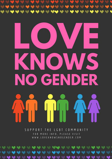
- This campaign poster is meant to promote a positive message about the equality of love to all genders of people.
- The pink colour pallet to the large title font helps emphasise with the audience about love and equality.
- The use of complimentary colours help represent the “Pride” symbol of the same sex marriage.
- The top and bottom parts of the poster uses colourful row of love hearts for a patterned effect.
- The negative space surrounding the fonts and illustrated people helps bring a balanced composition to the poster.
- The two male and female couples have the same symmetry to each other. This is another way the poster can give us a message about same sex marriage being equal.
- The poster’s texture has a clean, simple and effective look to it.
Road Safety Mind Maps and Poster Ideas
I had to draw out and expand upon 3 types of mind map ideas. These mind maps will help give me ideas to produce an illustrated road safety poster.
Mind Map Ideas
Mobile Phone
Each of these images show off the useful features related to each map plan category. Each of these features expand to show off more important facts about them.

Games

Communication

Poster Ideas
Once I was happy with my mind maps, I then used some of these ideas from each of them to help me produce some poster concept sketches.

- Game Over: The message of this poster is aimed to prevent drivers from speeding on the roads.
- Look Before Crossing!: This poster is mainly targeted for a younger audience, by encouraging them to look on both sides of the road before crossing.
- Don’t Get Distracted!: The poster shows off the risks and potential consequences of using a mobile phone while driving.
- Death Calls, Don’t Answer: The illustrated sketch to this poster has been designed to give its audience an example, by using a phone while driving could lead to car crash. The end results could not only take your away, but someone else too.
Road Safety Poster: Research and Fonts
- Grid – Unseen lines that align pieces on the image.
- Direction/Leading the eye – Using elements on the image that lead the eye to the target such as the slogan or an important image.
- Movement,Timing – For use in videos and posters, Motion blurs, movement lines etc.
- Shape – How are certain shapes used to represent things, or used to convey a message.
- Symbolism – Think of representation by use of certain colours, shapes, words and techniques.
- Typography – Effectiveness of fonts used in graphics. Why were those fonts, sizes and words chosen? What connotations does those things represent?
- Hierarchy – Giving certain things priority over other things. working out what takes importance over other things because this is important.
- Balance ”Weight” – Linked to symmetry but not prefect. Balance is more conceptually interesting.
- Composition – They way everything is put together and how it works.
- Randomness – Breaking these rules.
- Line – The way lines have been used and what message/s they are conveying, is it movement, emphasis and other feelings.
- Colour – Emotion, and the way those colours are used to make the piece work or not work. This about the choices the artist made and why by using certain colours
- Negative Space – How has the designer used negative space in their designs (this of the FedEx logo)
- Scale – Has scale is used to emphasise something?
- Repetition-Pattern – How are these things used? Did they repeat something to do with the colour or the slogan or something else.
- Convention – Different fonts being used of different things. This is breaking the convention, as people don’t expect things to be different or changed
- Symmetry – Is the reference symmetrical? or is it not? what effect does this have on how you see the image?
- Texture
- Contrast – Using the colour wheel in your description, are the colours, sizes and other factors contrasting?
- Breaking the Rules
Reference
amorganedcm1, V. (2018). Planning and Research Help. [online] Alice Morgan EDCM1. Available at: https://amorganedcm1.wordpress.com/2018/01/21/planning-and-research/ [Accessed 22 Jan. 2018].
Typography
Fonts
- Serif: New Times Roman
- Sans-Serif: Arial
- Script: Brush Script
- Slab Serif: Couries

Thumbnails
Many varied sketch examples of Road Safety thumbnails about seat-belts and also the dangers of using a mobile phone on the roads. These thumbnail sketches are based off my mind map ideas.


I have to choose a few examples from these sketches and draw each of them out again in better detail.
Graphics: Mobile Road Safety Poster
After planning out my map plans and sketches for my final poster design, I was ready to begin the development process on Photoshop.
Final Idea Sketch

This was the final concept sketch for my final poster. I wanted to include more features to the poster’s design by adding a mobile phone screen showing the skull. I also wanted to add some smoke effects to the background. I thought that this would add a greater impact to the poster’s design.
Photoshop Process

I had to create a landscape sized canvas for my poster on Photoshop.
- Image size: 1200 x 630 pixels
- 72 dpi (dots per inch)
I then did some online research for mobile phone screen illustrations. I picked a simple illustration with a transparent background and imported it.

- Filled in the transparent areas on the mobile’s screen with a black colour tone.

- I then imported my skull illustration into a separate layer.
- Then I placed the skull image into the center of the mobile screen.

- For the smoke effects, I created the effect by using the soft brush tool along with a grey colour tone.
- The brush tools opacity was lowed down to help add a more transparent effect to the smoke.

- Once I had done adding the smoke effect. I then added in the text for poster’s main slogan.
- After I finished this, I thought that the finale poster looked bland. This is because I over-used the soft brush tool for the smoke effect.
- The text’s font didn’t look great either and all the words were presented in upper-case. This could be more confusing for the target audience to read.
- The font didn’t match along well with skull and mobile image too.

- In this version, I cleared up most of the smoke effects using the lasso and feathering tool. This made the black coloured background stand out more, which added more depth to the poster itself.
- The liquifying tool added a more natural wave like effect to the smoke.
- The text was also improved from using a more suitable font that blends in well to the mood and theme of the poster.
- “DEATH” is now the only word to use the upper-case feature. This also adds to the poster’s subjective theme about the dangers of using mobile phones while driving.
- It is neatly presented and easy to follow for the target audience.
Final Outcome/Evaluation

This was my final poster design that I finished for my client based poster project in Road Safety. Throughout this client based poster project, I thought that I got on really well with it. The development sketches and map plans helped gave me ideas along the way for my final poster design. I was happy with the improvements I made to my previous design that I originally intended. This is because of how the font, background smoke and mobile illustration all effectively go well together. The mobile illustration still does look a bit bland from a design point. This could be improved by adding in “Answer?” under the skull image. Some of the harsh areas of the smoke effects could be softly erased to add more depth to the background. I thought that this poster’s design and slogan manages to get its message across to the audience in an effective manner.
