
After planning out my map plans and sketches for my final poster design, I was ready to begin the development process on Photoshop.
Final Idea Sketch

This was the final concept sketch for my final poster. I wanted to include more features to the poster’s design by adding a mobile phone screen showing the skull. I also wanted to add some smoke effects to the background. I thought that this would add a greater impact to the poster’s design.
Photoshop Process

I had to create a landscape sized canvas for my poster on Photoshop.
- Image size: 1200 x 630 pixels
- 72 dpi (dots per inch)
I then did some online research for mobile phone screen illustrations. I picked a simple illustration with a transparent background and imported it.
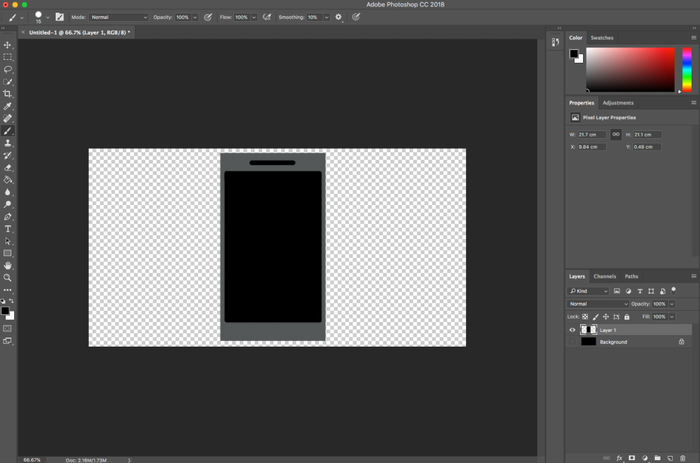
- Filled in the transparent areas on the mobile’s screen with a black colour tone.
- I then imported my skull illustration into a separate layer.
- Then I placed the skull image into the center of the mobile screen.
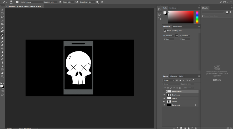
- For the smoke effects, I created the effect by using the soft brush tool along with a grey colour tone.
- The brush tools opacity was lowed down to help add a more transparent effect to the smoke.

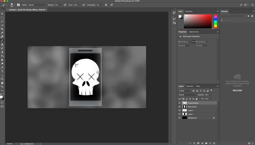
- Once I had done adding the smoke effect. I then added in the text for poster’s main slogan.
- After I finished this, I thought that the finale poster looked bland. This is because I over-used the soft brush tool for the smoke effect.
- The text’s font didn’t look great either and all the words were presented in upper-case. This could be more confusing for the target audience to read.
- The font didn’t match along well with skull and mobile image too.

- In this version, I cleared up most of the smoke effects using the lasso and feathering tool. This made the black coloured background stand out more, which added more depth to the poster itself.
- The liquifying tool added a more natural wave like effect to the smoke.
- The text was also improved from using a more suitable font that blends in well to the mood and theme of the poster.
- “DEATH” is now the only word to use the upper-case feature. This also adds to the poster’s subjective theme about the dangers of using mobile phones while driving.
- It is neatly presented and easy to follow for the target audience.
Final Outcome/Evaluation
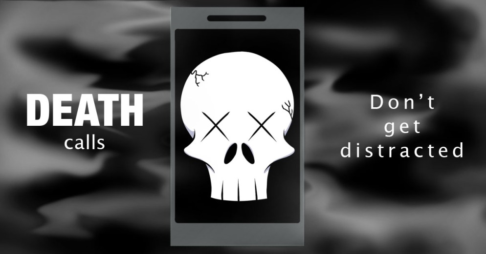
This was my final poster design that I finished for my client based poster project in Road Safety. Throughout this client based poster project, I thought that I got on really well with it. The development sketches and map plans helped gave me ideas along the way for my final poster design. I was happy with the improvements I made to my previous design that I originally intended. This is because of how the font, background smoke and mobile illustration all effectively go well together. The mobile illustration still does look a bit bland from a design point. This could be improved by adding in “Answer?” under the skull image. Some of the harsh areas of the smoke effects could be softly erased to add more depth to the background. I thought that this poster’s design and slogan manages to get its message across to the audience in an effective manner.
